First Databank - AnalyseRx
Optimising medicine support
As the exclusive product designer, my role was to infuse user-centred design standards and principles into an outdated digital healthcare product. The primary business goals included increasing Analyse RX sales to Clinical Commissioning Groups (CCGs) by 40% and improving clinician adoption and daily usage by 50%.
CLIENT
First Databank
ROLE
User Research/Testing, UX/UI Design, Design System
DATE
March 2023
Understand
First Databank, the UK's foremost provider of prescribing support, presents AnalyseRx as their key digital product. It not only integrates with clinical systems but is also utilised by clinicians across the country. Within my role, my responsibility extended beyond achieving business goals. I was charged with promoting product design in a company that typically overlooked user testing and design strategies, opting instead for a more costly development-first methodology.
Analytics revealed that user engagement with the app significantly dropped off after its initial installation. Interviews conducted to uncover the reason found that the app's complex interface and overwhelming design deterred users from interacting with it daily.
-
Before
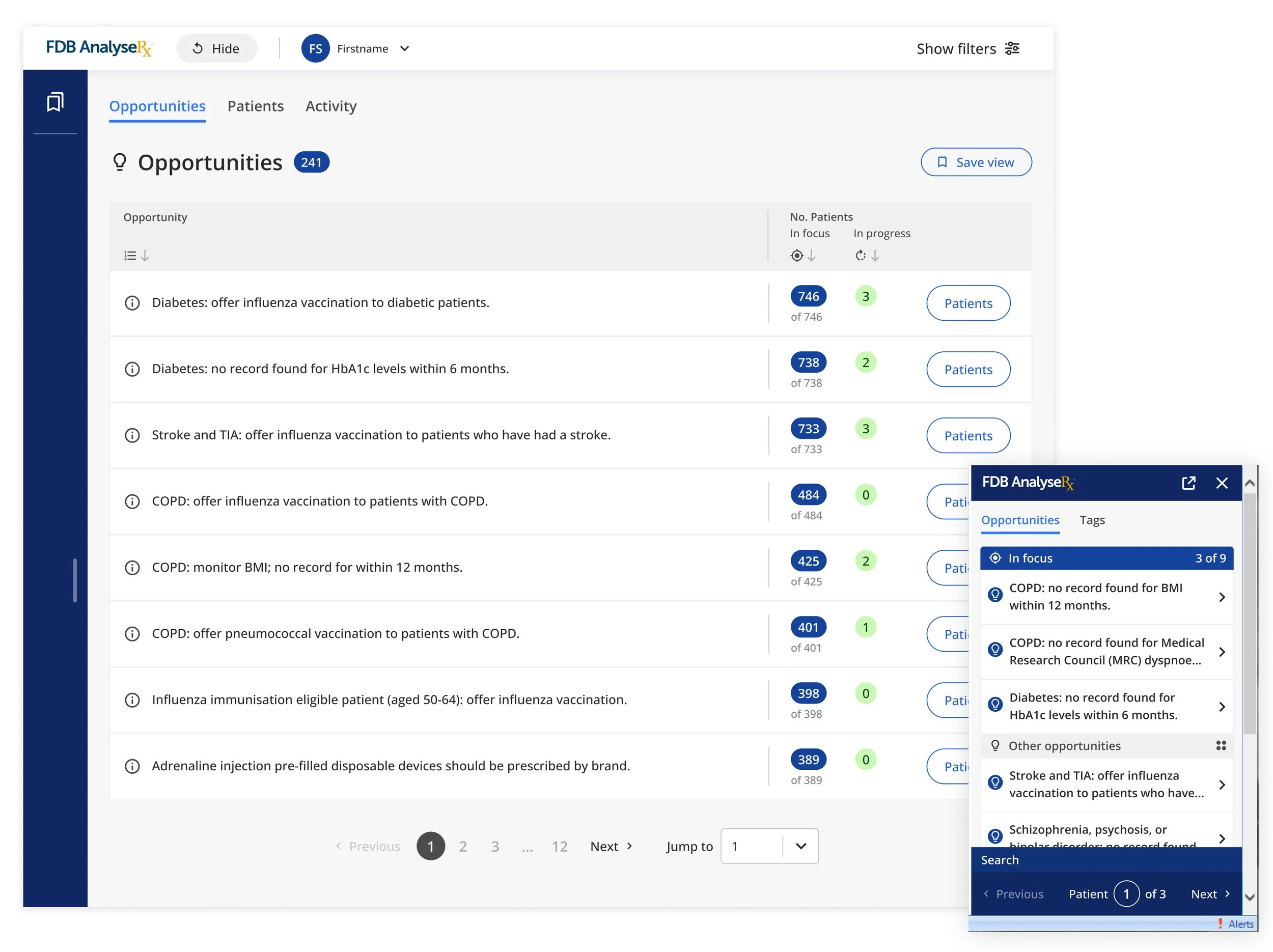
User testing of the AnalyseRx product highlighted its overwhelming complexity, excessive clutter, a disconnect between the dashboard and sidebar, and overlooked call-to-action buttons

-
After
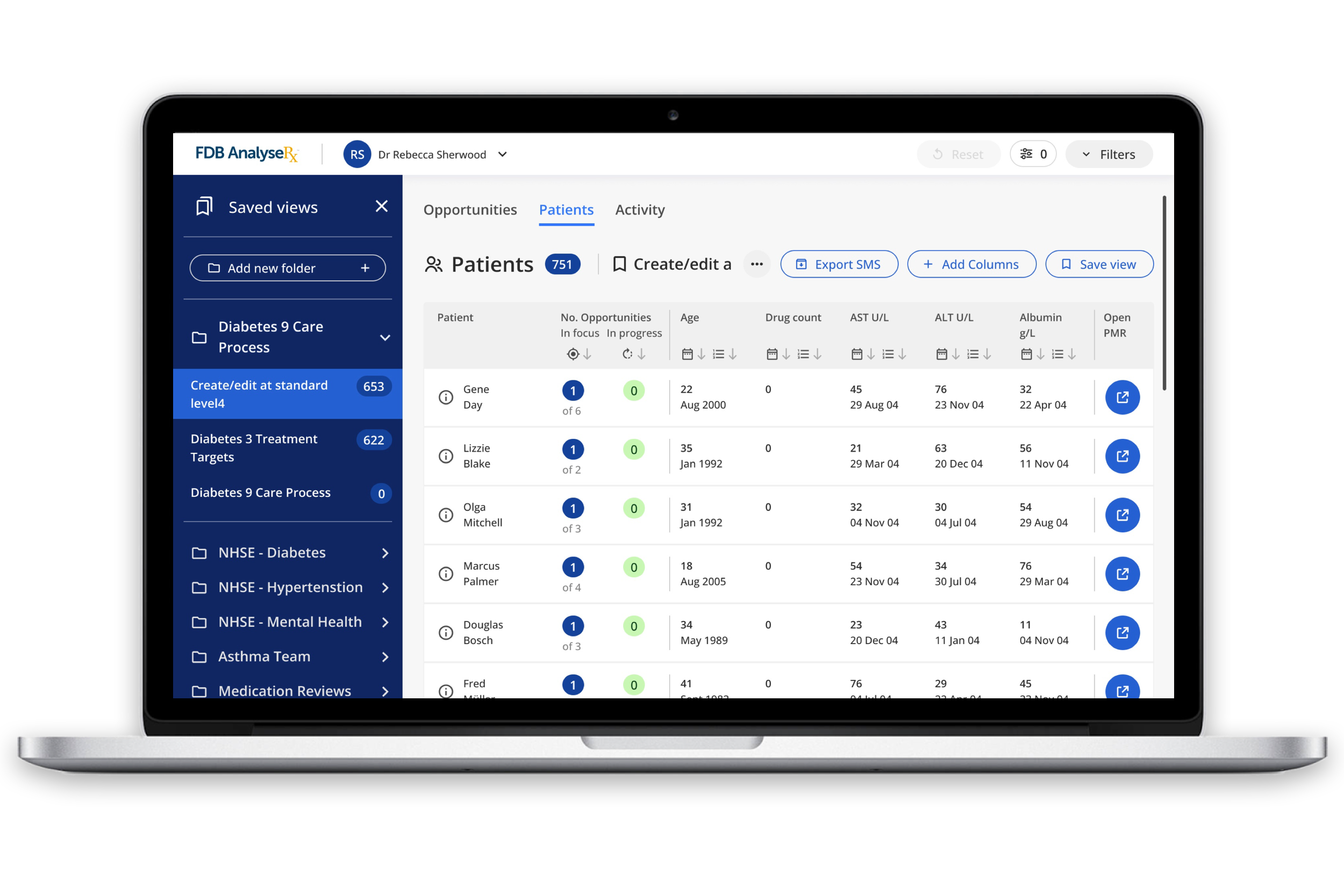
The redesign featured a modern, professional look, eliminating unnecessary elements to improve task efficiency and make content clearer. A new collection of icons was added to aid in categorisation and enhance signposting, while all accessibility issues were resolved.

Explore
Tasked with a UX/UI audit on a product I was still familiarising myself with, I identified key areas where it fell short of design best practices and flagged significant accessibility issues. From my unique external perspective, I pinpointed critical improvements, suggesting targeted design solutions to enhance usability and accessibility, streamlining the user experience for better engagement and satisfaction.
Undertaking user testing with real users and conducting interviews with content authors offered genuine insights for the first time in the products history. Through analysing competitors and collaborating closely with the development team, I merged sketches and ideas into initial concepts and presented these to stakeholders.
Delving deeper
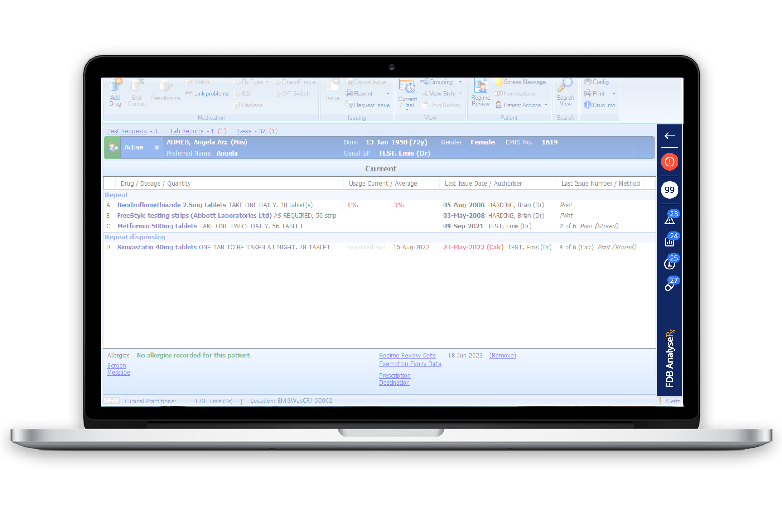
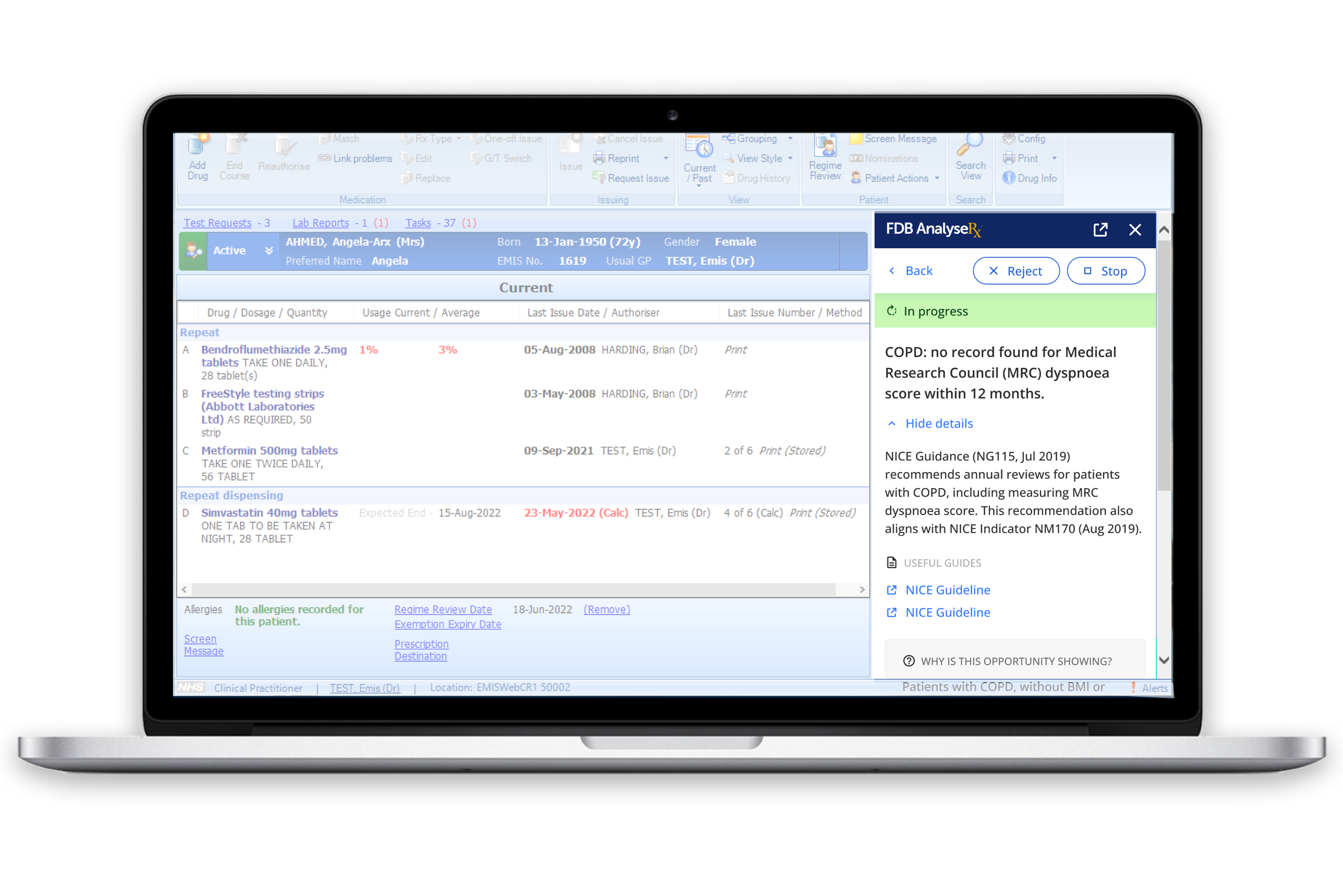
AnalyseRx features two distinct interfaces: the main standalone dashboard, which operates independently, and the "Sidebar," which, while connected to the dashboard, is integrated within Emis Web, a clinical system. The "Sidebar" is designed with a patient-centric approach, alerting clinicians to potential improvements in patient health.
Creating a functional collapsed state for the "Sidebar" was a complex task. As a crucial legacy component, its unique shape made it hard to keep text legible and still act as a vital visual indicator for clinicians to swiftly review patient alerts. I explored various design concepts aimed at capturing attention while effectively displaying the required information.
Validate
Faced with a product's complexity and a business not well-versed in product design practices, I opted for iterative UI updates to modernise and simplify the interface initially. Users primarily struggled with the complexity and the dense information presented. Through user interviews, I found that features like filtering and saved views, which occupied significant space, were not frequently used. The consensus was to streamline these features, making them accessible on demand rather than permanently visible. This change aimed to allocate more pixel space for essential data, leading to a cleaner interface that significantly reduced information overload.
Initial user testing showed a positive response to the new feature allowing users to hide and expand main dashboard options, which was praised for its ease of use. The updated, more professional appearance also received favorable feedback, with all users completing their tasks smoothly, highlighting a notable enhancement over prior versions. Simplifying the design by using consistent styles for similar call-to-action buttons further streamlined the interface and eliminated user confusion.
Create
I developed FDB's inaugural design system and reusable components, leveraging Figma's auto layout feature. While the application's requirements didn't initially include mobile resolutions, employing auto layout ensures that, should these requirements evolve, adapting the design system for mobile compatibility becomes significantly more straightforward.
Accommodating user-configurable columns presented a significant design challenge. Each row's flexibility needed careful consideration to maintain content visibility, especially when activating extra page features that substantially reduced the available pixel space.
Delivery
Following the redesign, we witnessed a monumental surge, with the Annual Contract Value soaring by over 1000% in the first year alone. Moreover, this redesign led to an extraordinary increase in user adoption, with figures climbing over 2000%.
Working closely with the development teams from start to finish ensured a seamless transition from design to implementation, culminating in a triumphant result.


Reflection
The success of the redesign of AnalyseRx highlights the critical importance of integrating product design and user-centred principles, greatly enhancing the product's usability for its users. Just as I was preparing to delve into further iterations and enhancements for phase 2 post-launch, the impact of this achievement caught the attention of the wider business.
As a result, my product design skills were sought after for another digital product requiring enhancements, showcasing the value and adaptability of my design methodology. This cycle of recognition and application of my expertise not only led to several contract extensions but also fostered enduring professional relationships.


